


The Big Picture |
- Gauging the Momentum of the Labor Recovery
- 10 Thursday PM Reads
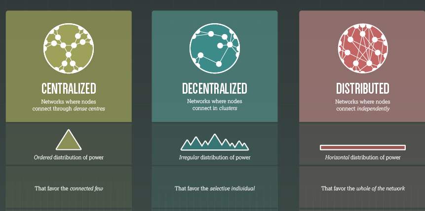
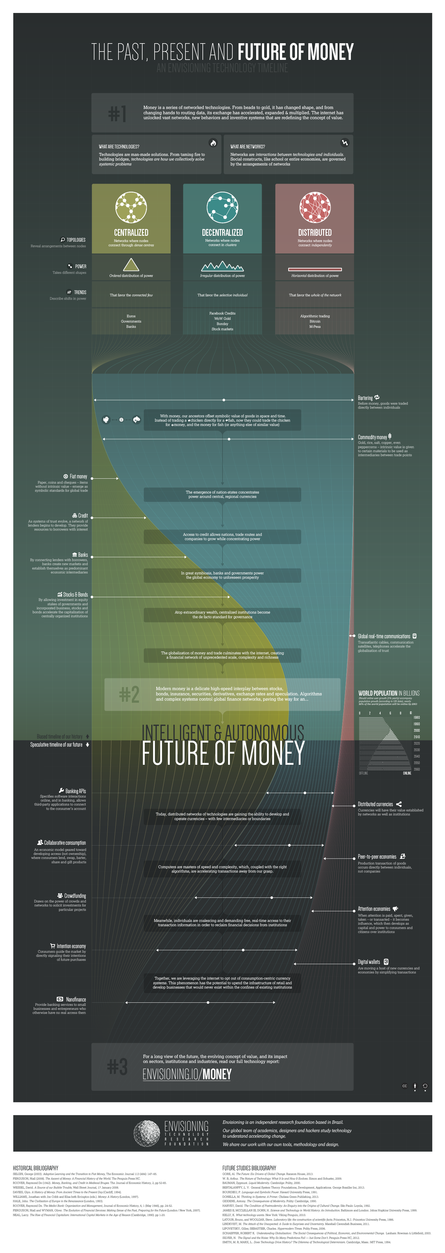
- Past, Present, and Future Money (Topologies, Powers, Trends)
- Secular Bull Market Roadmap
- 10 Thursday AM Reads
- The Truth About the Deficit
- Inside the GOP: Report on focus groups with Evangelical, Tea Party, and moderate Republicans
| Gauging the Momentum of the Labor Recovery Posted: 18 Oct 2013 02:00 AM PDT Gauging the Momentum of the Labor Recovery
Federal Reserve policymakers are watching a broad set of indicators for signs of "substantial" labor market improvement, a key consideration for beginning to scale back asset purchases. One way to find which are most useful is to focus on how well movements in these indicators predict changes in the unemployment rate. Research suggests that six indicators are most promising. They offer evidence that the recovery has more momentum now than a year ago, a strong signal that the labor market is improving and could accelerate in coming months. In September 2012, U.S. monetary policymakers explicitly tied future policy actions to signs of "substantial improvement" in the outlook for the labor market. They also said that, in deciding whether this condition had been met, they would consider a broad set of labor market indicators to augment information on the unemployment rate. In this Economic Letter, we consider which indicators best signal future improvement in the unemployment rate. We identify six such leading indicators of labor market improvement. These indicators reveal that, while the health of the labor market has not yet returned to its pre-recession level, there are encouraging signs of positive momentum. Taken together, these signs point to continued improvement in the labor market. Indicators of labor market momentum In its September 2012 meeting, the Federal Reserve's policymaking body, the Federal Open Market Committee (FOMC) announced it would make monetary policy decisions conditional on substantial improvement in the outlook for the labor market (Bernanke 2012). Since then, many researchers have looked at a large set of labor market indicators to determine which might offer the best guidance for this criterion (Federal Reserve Bank of Atlanta 2013, Hakkio and Willis 2013, Stehn 2013). All of these studies have focused on coincidental measures that capture the current state of the labor market or the current rate at which conditions are improving. By contrast, we look for indicators that signal future improvements in the labor market, particularly in the unemployment rate. This allows us to characterize the degree of momentum underlying the labor market recovery and make statements about the outlook for the labor market in coming months. We begin by considering a wide array of data on labor market conditions in the United States. This includes information on employment, unemployment, the rate at which people quit existing jobs, the number of people who get hired, employers' perceptions of the ease of filling their job vacancies, and workers' sentiment about the state of the overall labor market. Because each of these series comes from a different source, comparing them requires putting them on equal footing in terms of how they're measured. We do this by normalizing each indicator, as well as its 6-month change, to reflect how much it deviates from its own historical average at any point in time. In particular, we perform a statistical test by measuring how many standard deviations an indicator is from its historical average. The normalized six-month change in an indicator gives us a sense of whether it has a persistently strong correlation with the unemployment rate. We call this persistence number "momentum." Finally, to make these data easier to compare, we transform them so they all move in the same direction over the business cycle. For example, the unemployment rate tends to decline when payroll job growth increases. To make job growth move in the same direction as the unemployment rate, we change its sign. We focus on the period from January 1978 to mid-2013. Our main interest is identifying those indicators whose movements over the past six months are most highly correlated with changes in the unemployment rate in the next six months. Because we are interested in the signals these data send about improvement in the outlook for the labor market, we calculate correlations over labor market expansions only, and do not include recessions. This is important because indicators that lead the labor market during downturns are not necessarily as informative during expansions. A prime example is the number of layoffs, which helps assess the depth of a downturn but is of little use in gauging the strength of a recovery. This is because the strength of recoveries is based on the rate at which people find jobs, which can remain low for some time after layoffs have subsided (Elsby, Hobijn, and Şahin, 2013). Table 1
Sources: Bureau of Labor Statistics, Conference Board, Federal Reserve Board of Governors, Institute of Supply Management, Department of Labor, and FRBSF staff calculations. Among the 30 indicators we analyze, six stand out as excellent predictors of future improvements in the unemployment rate. Indeed, these six predict future changes in the unemployment rate better than lagged improvements in the unemployment rate itself. These indicators are the insured unemployment rate, initial claims for unemployment insurance, capacity utilization, the jobs gap, the Institute for Supply Management (ISM) manufacturing index, and private payroll employment growth. Among these common indicators, the jobs gap is the least familiar. Taken from the Conference Board's Consumer Confidence Survey, it measures the difference between the percentage of households that considers jobs hard to get and the percentage that considers jobs plentiful. The six indicators are listed in Table 1 in order of their predictive power for future changes in the unemployment rate, as captured by the correlation between the indicators' momentum, and changes in the unemployment rate during the subsequent six months. These correlations are printed in boldface in the second column of the table. The unemployment rate is listed in the first row for comparison. Comparing the first row with the other rows shows that the momentum of these indicators are all more closely correlated with the future change in the unemployment rate than the momentum of the unemployment rate itself. That is, when considering the speed at which the unemployment rate will come down, changes in our six indicators are better predictors than changes in the unemployment rate. This is precisely the value of these six momentum indicators. Assessing the current labor market recovery Figure 1
Sources: Bureau of Labor Statistics, Conference Board, Federal Reserve Board of Governors, Institute of Supply Management, Department of Labor, and FRBSF staff calculations. Although we use our indicators primarily as a measure of momentum, it is useful to assess where they stand relative to their normal levels. This gives us an idea of the current state of the labor market rather than the rate at which conditions are improving. The paths of the normalized levels of the indicators from 2003 to 2013 are shown in Figure 1. The figure highlights several key insights from our momentum measures. First, beyond the decline in the unemployment rate, a broad set of measures reflect improvements in labor market conditions, and the leading indicators are moving in a direction consistent with a strong labor market. This is important given that recent declines in the unemployment rate have coincided with declines in labor force participation, which has muddied the positive signal about the market's recovery. The second thing is that, while most of these indicators have not returned to normal levels, they are beginning to approach their historical averages, represented by the zero line. Finally, and perhaps most importantly for evaluating confidence in these improvements, the dispersion of these measures has narrowed markedly. This tells us that the labor market is improving along a variety of dimensions, not just a few isolated measures. These points suggest that labor market activity is beginning to converge to levels consistent with past recoveries rather than continuing at the highly suppressed pace that has defined the past few years. Turning back to our momentum measure, Table 1 shows the two indicators that best predict future changes in the unemployment rate are the insured unemployment rate and initial claims for unemployment insurance (column 2, rows 2 and 3). This suggests that labor market recoveries tend to begin with the hiring of workers who are eligible for unemployment insurance and who tend to have longer previous work histories. In addition, workers' and employers' perceptions of economic conditions, as captured in the jobs gap and the ISM index, respectively, also are good indicators of the momentum in the labor market. The last two columns of Table 1 show what these leading indicators signal about the pace of the labor market recovery a year ago, in September 2012, and what they signal today. In these columns, the more negative the number, the faster the decline in the unemployment rate over the next six months implied by the change in the indicator. So a negative number is a good thing. For clarity, the columns are color-coded from red to green. The darker the green, the stronger the signal for the pace of the recovery. Across the board, these indicators show the pace of the labor market recovery has increased compared with a year ago. We take this as evidence that the recovery in the labor market is robust, broad-based, and likely to continue, if not accelerate, over the coming months. Conclusion The Great Recession took an enormous toll on the labor market, which has been reflected in the deterioration of many labor market indicators. The pace of labor market improvement has been modest since the end of the recession, and many indicators have not yet returned to their pre-recession levels. Still, the improvements are visible in a broad set of indicators. The question then is whether we can expect these improvements to continue and at what pace. In this Economic Letter, we identified six indicators that lead future changes in the unemployment rate and that can be used to gauge the current momentum of the labor market recovery. All these indicators show that the recovery has more momentum now than a year ago. This is a strong signal that labor market improvement will continue at their current modest pace, and could even accelerate in the coming months. Of course, whether this increase in momentum amounts to a "substantial improvement" in the outlook for the labor market is a question for policymakers to decide. Mary C. Daly is a senior vice president and associate director of research in the Economic Research Department of the Federal Reserve Bank of San Francisco. Bart Hobijn is a senior research advisor in the Economic Research Department of the Federal Reserve Bank of San Francisco. Benjamin Bradshaw is a research associate in the Economic Research Department of the Federal Reserve Bank of San Francisco.
References Bernanke, Ben S. 2012. "FOMC Press Conference on September 13." Federal Reserve Board of Governors. Elsby, Michael, Bart Hobijn, and Ayșegül Șahin. 2013. "Unemployment Dynamics in the OECD." Review of Economics and Statistics 95(2), pp. 530–548. Federal Reserve Bank of Atlanta. 2013. "Labor Market Spider Chart." Web page, updated September 10. Hakkio, Craig S., and Jonathan L. Willis. 2013. "Assessing Labor Market Conditions: The Level of Activity and the Speed of Improvement." The Macro Bulletin, FRB Kansas City, July 18. Stehn, Sven J. 2013. "Tracking Labor Market Improvement." Goldman Sachs U.S. Daily, March 27.
|
| Posted: 17 Oct 2013 01:30 PM PDT My afternoon train reading:
What are you reading?
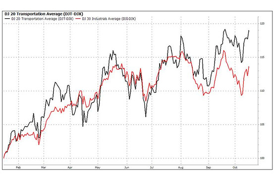
Dow Transports Hit Fresh Record, Industrials May Follow |
| Past, Present, and Future Money (Topologies, Powers, Trends) Posted: 17 Oct 2013 11:30 AM PDT |
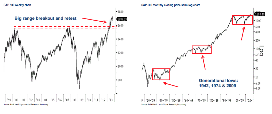
| Posted: 17 Oct 2013 09:00 AM PDT Click to enlarge
We have not looked at this chart in a few quarters. Here’s Merrill:
The key question is, are we now 5 years into a 1982 – 2000 type of a secular bull market, or is this merely a post 19734-74 bounce?
Source: |
| Posted: 17 Oct 2013 06:45 AM PDT
My morning reading:
What are you reading?
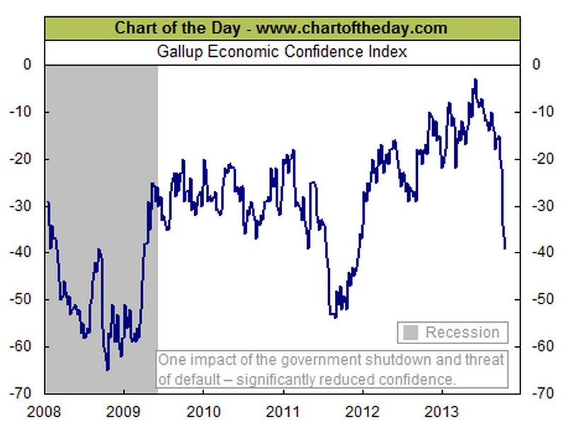
Gallup Economic Confidence Index |
| Posted: 17 Oct 2013 04:15 AM PDT Yesterday, I was on Pete Dominick’s Sirius XM Satellite radio show (audio below). A caller asked about how to close the defici. His comments revealed that his concern about the deficit was merely a ruse, a tool to be used to achieve very different goals. If you are truly concerned about deficit, then what you must do is (eventually) raise taxes and cut spending — that is how you balance the budget. Current deficit is now ~$550B, down from over $1T. Ian Shepherdson, the chief economist of Pantheon Macroeconomics, wrote "We are baffled by the idea that the pace of deficit reduction needs to be increased, given how rapidly the picture is improving already." If the tax cuts from 2001, 2003 were repealed, half of that deficit goes away. If the FICA cap is lifted from $113k and allowed to rise to $250k or $500k, SS is solvent for 75 years. If the US no longer spent the equivalent of the next 20 countries COMBINED on Defense, a huge chunk of the deficit goes away. The US now spends 2X what most developed nations spend on healthcare. If you are concerned about the long term debt, than you must develop a system that radically lowers US health care costs, bringing them into line with what other industrialized nations spend. You cannot tax cut your way to fiscal solvency in a weak economy any more than you can spend your way there in a slow recovery. However, you can make the deficit worse with poorly timed tax increases or poorly timed spending cuts. My read of the current situation is that it has nothing to do with the deficit. The past votes of the current Deficit Peacocks reveal that it is not important to them. Unfunded tax cuts (2001, ’03), expensive wars of choice (most recently, Iraq), and unfunded entitlements (Medicare Part D) reveal that most of the people currently clamoring about the deficit have precisely zero interest in reducing it. They are merely using the deficit as a tool to pursue their ideology. The current debate has revealed two things: Some people very much want a MUCH smaller government, including much lower taxes. But, they know that is very unpopular among the broad public when you start specifying what to actually cut. It is an ideological goal with which most of the country disagrees. So, the argument that appears more reasonable is to come out against deficits. Have a look at Center of American Politics – Statistics and Numbers on American Politics from Esquire. While there are some areas of overlap, its pretty clear that the Tea Party is so out of step with most of the USA. Want to fix the deficit? Then make the hard choices to cut spending and raise taxes (even if you implement this in later years). Want to have a much smaller US government? The way to do that is not with the deficit or the debt ceiling or other misdirected tactics — instead, try having an honest debate on the subject, and see if you can convince a majority of your fellow Americans to that view . . .
~~~ Stand Up with Pete Dominick XM Satellite October 16, 2013 This posting includes an audio/video/photo media file: Download Now |
| Inside the GOP: Report on focus groups with Evangelical, Tea Party, and moderate Republicans Posted: 17 Oct 2013 02:30 AM PDT If you want to understand the government shutdown and crisis in Washington, you need to get inside the base of the Republican Party. That is what we are doing in the Republican Party Project and these focus groups with Evangelicals, Tea Party, and moderate Republicans. All the passion, nuances and divisions found expression when we conducted this work in the summer. Understand that the base thinks they are losing politically and losing control of the country – and their starting reaction is "worried," "discouraged," "scared," and "concerned" about the direction of the country – and a little powerless to change course. They think Obama has imposed his agenda, while Republicans in DC let him get away with it. Inside the GOP: Report on focus groups with Evangelical, Tea Party, and moderate Republicans
Click to enlarge Source: |


| You are subscribed to email updates from The Big Picture To stop receiving these emails, you may unsubscribe now. | Email delivery powered by Google |
| Google Inc., 20 West Kinzie, Chicago IL USA 60610 | |


0 comments:
Post a Comment