


The Big Picture |
- 10 Wednesday PM Reads
- Cartogram: Jobless Rate Change Since Great Recession
- 10 Wednesday AM Reads
- NFP, Inflation & Conspiracy Theories
- Napster’s Culture of Free
| Posted: 10 Dec 2014 02:30 PM PST My afternoon train reads:
What are you reading?
|
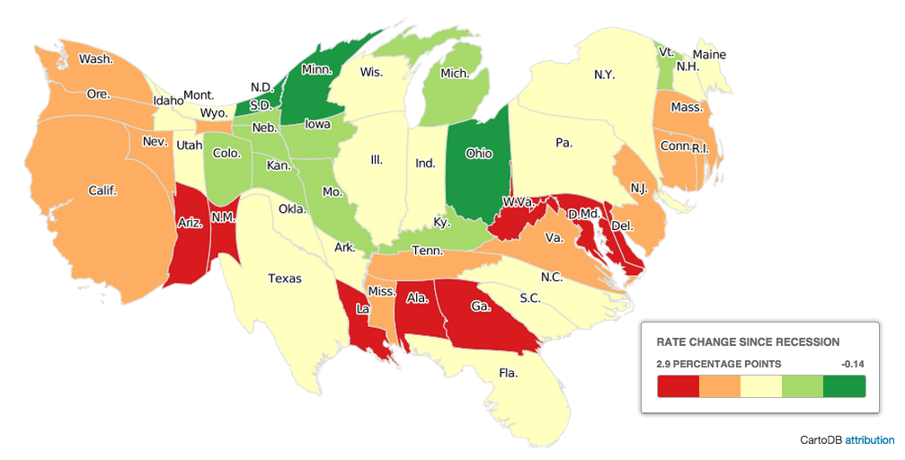
| Cartogram: Jobless Rate Change Since Great Recession Posted: 10 Dec 2014 09:15 AM PST click for interactive chart
Great set of interactive charts at the WSJ showing differing views of American employment. Maps include Jobless Rate Change, 2013-14; Labor Force Percentage Change, and the map above of Jobless Rate Change Since the Great Recession Began. The cartograms are sized not by their physical acreage, but rather by their civilian labor force populations. It is a density-equalized view of regional employment. Click through to WSJ to see the other versions.
|
| Posted: 10 Dec 2014 05:00 AM PST My morning train reads:
|
| NFP, Inflation & Conspiracy Theories Posted: 10 Dec 2014 04:12 AM PST
Today's column is about stupidity. Perhaps that’s overstating it; to be more precise, it is about the conspiracy-theorist combination of bias, innumeracy and laziness, with a pinch of arrogance thrown in for good measure. I am talking about the manifold ways various economic reports get misinterpreted, sometimes in a willful and ignorant manner. That's right, I am calling some of you ignorant (not you, but the guy next to you). There are things we all should understand about how specific data series work in the real world. However, I want to make a distinction between legitimate criticisms of the details of any economic report and wild-eyed accusations of falsification. Let's start with the employment report. Long-time readers know I am not a fan of the monthly data releases, preferring instead to focus on the trend. This report is an attempt to assess the changes in a labor pool of about 150 million workers in real time, and is highly subject to revision. Like all data series based on a model, it is often wrong but useful. Over the years, I have criticized many aspects of the models that underlie economic news releases: Business birth and death adjustments can yield a serious misreading of the labor market's health. The tendency to ignore the broader unemployment landscape in the U6 numbers in favor of the U3, or the official unemployment rate, also misses significant trend changes. I have also written about reconciling the household and establishment series. The new home sales data series is also very noisy and unreliable. And don't get me started on the many issues with the various inflation-modeling issues, such as hedonics and substitution. However, the MIT billion prices project shows that while the Bureau of Labor Statistics inflation data are quite imprecise, they are consistent, and therefor helpful. Back to the foolishness that pervades the world of the conspiracy theorists. Let's begin with perhaps the most infamous charge, made by former General Electric Chief Executive Officer Jack Welch, the month before the 2012 election . . .
|
| Posted: 10 Dec 2014 03:00 AM PST |

| You are subscribed to email updates from The Big Picture To stop receiving these emails, you may unsubscribe now. | Email delivery powered by Google |
| Google Inc., 1600 Amphitheatre Parkway, Mountain View, CA 94043, United States | |


0 comments:
Post a Comment