


The Big Picture |
- Combining Models for Forecasting and Policy Analysis
- State Minimum Wage Map
- Millenials, Social Media + Competition for Employees Are Behind McDonald’s Pay Raise
- The Anomaly That Is The Payroll Report
- 10 Thursday AM Reads
- Winners and Loser of the Global Financial Markets
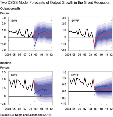
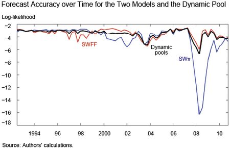
| Combining Models for Forecasting and Policy Analysis Posted: 03 Apr 2015 02:00 AM PDT by Marco Del Negro, Raiden Hasegawa, and Frank Schorfheide Model uncertainty is pervasive. Economists, bloggers, policymakers all have different views of how the world works and what economic policies would make it better. These views are, like it or not, models. Some people spell them out in their entirety, equations and all. Others refuse to use the word altogether, possibly out of fear of being falsified. No model is "right," of course, but some models are worse than others, and we can have an idea of which is which by comparing their predictions with what actually happened. If you are open-minded, you may actually want to combine models in making forecasts or policy analysis. This post discusses one way to do this, based on a recent paper of ours (Del Negro, Hasegawa, and Schorfheide 2014). We call our approach "dynamic prediction pools," where "pools" is just another word for model combination and "dynamic" sounds a lot better than "static." Seriously, we want an approach to combining models that recognizes the fact that the world changes, that we have no perfect model, and that models that worked well in some periods may not work well in others. We apply our approach to two New Keynesian Dynamic Stochastic General Equilibrium (DSGE) models, one with and one without financial frictions. (We call them SWπ and SWFF, respectively, where the SW underlines the fact that they are both based on the seminal work of (Smets and Wouters.) So much for model diversity, you may be thinking. Aren't these two models like Tweedledee and Tweedledum? Not quite, as the chart below shows. The chart (which is taken from a different paper of ours, Del Negro and Schorfheide [2013]) shows the two DSGE model forecasts for output growth and inflation obtained with information available on January 10, 2009, at the apex of the financial crisis (2008:Q4 information was not yet available on that date, so this forecast is effectively based on National Income and Product Account data up to 2008:Q3). Specifically, each panel shows GDP growth (upper panels) or inflation (lower panels) data available at the time (the solid black line), the DSGE model's mean forecasts (the red line), and bands of the forecast distribution (the shaded blue areas representing the 50, 60, 70, 80, and 90 percent bands for the forecast distribution in decreasing shade). The chart also shows the Blue Chip forecasts (diamonds) released on January 10, and the actual realizations, according to a May 2011 vintage of data (the dashed black line). All the numbers are quarter-over-quarter percent change. It appears that an econometrician using the SWπ model would have had no clue of what was happening to the economy. The SWFF model, though, predicts output in 2008:Q4 just as well as the Blue Chip forecasters and a subsequent very sluggish recovery and low inflation, which is more or less what happened afterwards. (To better understand the behavior of inflation in the last five years, see a previous Liberty Street Economics post entitled "Inflation in the Great Recession and New Keynesian Models.") The key difference between the two models is that SWFF uses spreads as a piece of information for forecasting (the spread between the Baa corporate bond yield and the yield on ten-year Treasuries, to be precise) while the SWπ model does not. The reason why we look at these two models is that before the crisis many macroeconomists thought that spreads and other financial variables were not of much help in forecasting (see this article by Stock and Watson). The chart above suggests that the issue of which of the two models forecasts better is pretty settled. Yet the chart below shows that this conclusion would not be correct. It shows the forecasting accuracy from 1991 to 2011 for the SSWπ (the blue line) and the SWFF (the red line) models, as measured by the log-likelihood of predicting what actually happened in terms of four-quarter averages of output growth and inflation, with lower numbers meaning that the model was less useful in predicting what happened. For long stretches of time, the model without financial frictions actually forecasts better than the model with frictions. This result is in line with Stock and Watson's findings that financial variables are useful at some times, but not all times. Not surprisingly, these stretches of time coincide with "financially tranquil" periods, while during "financially turbulent" periods such as the dot-com bust period and, most notably, the Great Recession, the SWFF model is superior. The relative forecasting accuracy of the two models changes over time and so we would like a procedure that puts more weight on the model that is best at a given point in time. Does our dynamic pools procedure accomplish that? You can judge for yourself from the chart below, which shows in three dimensions the distribution of the weights over time (the weights are computed using an algorithm called "particle filter"; we make both the codes and the data–the log-likelihoods of the two models shown in the chart above–available). We want to stress that this exercise is done using real-time information only—that is, for projections made in 2008:Q3, no data past that date were used in constructing the weights. The distribution of the weights moves like water in a bucket. When there is little information, such as at the beginning of the sample when the difference in forecasting ability between the models is small, the distribution is flat. During periods when one model is clearly better than the other, the bucket tilts to one side, and the water/mass piles up at the extremes. Fortunately, the mass seems to move from one side to the other of the bucket in a fairly timely way. The chart below compares the forecasting accuracy of the SWπ and SWFF models with that of dynamic pools (in black). As we noted before, the ideal model combination is the one that puts all the weight on the model that has the most accurate projection. The problem is, you know which one that is only afterwards. A measure of success is the extent to which your real-time combination produces a forecast that is as accurate as possible to that of the best model. The chart shows that the forecast accuracy of the dynamic pools approach is quite close to that of the best model most of the time, and in particular during the Great Recession. This confirms that the bucket tilted early enough in the game and shifted the weight toward the model with financial frictions. We show in the paper that, because of this timeliness, our procedure does generally better than the competition in terms of out-of-sample forecasting performance. Now, imagine you are a policymaker and are contemplating the implementation of a given policy. Consider also that this policy achieves the desired outcome in one model, but not in the other. Clearly the decision of whether to implement the policy depends on which model is the right one. You do not quite know that, but you do know the weights. Using them to come up with an assessment of the pros and cons of a given policy is the topic of our next post. Source: Federal Reserve Bank of New York |
| Posted: 02 Apr 2015 01:00 PM PDT
|
| Millenials, Social Media + Competition for Employees Are Behind McDonald’s Pay Raise Posted: 02 Apr 2015 08:30 AM PDT There has been surprising news across minimum-wage land: Paychecks are beginning to rise. Earlier this year, Wal-Mart raised its minimum pay to $9 an hour, then Target matched. Now McDonald’shas improved on those rates. Starting July 1, McDonald's will pay at least $1 an hour more than the local minimum wage for workers at the restaurants it owns in the U.S., the Wall Street Journal reported. As always, the devil is in the details. And while those details have been far less dramatic than the headlines, they are worth exploring. The motivations of the companies are even more intriguing. Before we delve into why McDonald’s did this, let’s look at a bit of recent history. In February, Wal-Mart, the nation’s largest private employer, said that as of this month it would raise its minimum pay nationwide to $9 an hour — $1.75 more than the federal minimum of $7.25. As we noted, this was a raise for about a half-million Wal-Mart workers in the U.S. In February 2016, the company's minimum rises to $10. Continues here: The Empty Feeling of McDonald’s Pay Raise
|
| The Anomaly That Is The Payroll Report Posted: 02 Apr 2015 06:00 AM PDT Goldman Sachs – David Mericle: Has Employment Growth Been Running Too Hot? (No Link) Comment The above Goldman report caught our eye recently. The baseline scenario of their nonfarm payroll model concludes job growth will eventually decline to just under 200k jobs per month. As with any model, however, the output is only as good as the assumptions used when calculating the figures. Consider the following regarding Goldman's GDP assumptions:
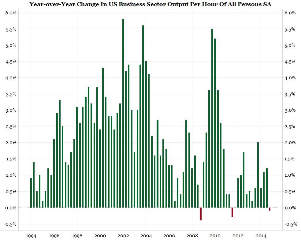
Payrolls have actually been outpacing GDP growth to such a degree that productivity is collapsing. Note the chart below is through Q4. If the Atlanta Fed's GDPNow current level holds, we could see an even bigger plunge in productivity when Q1 data is released. As we wrote last week:
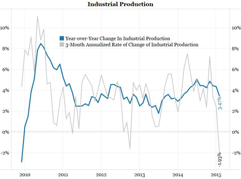
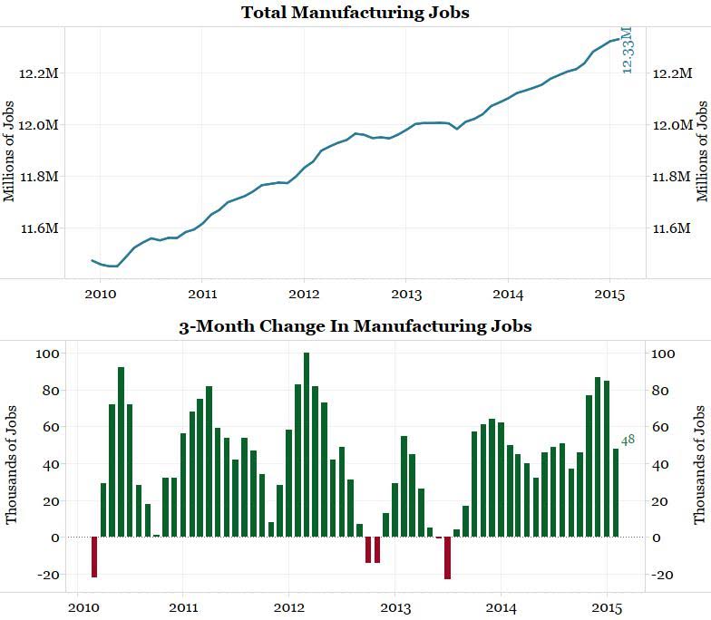
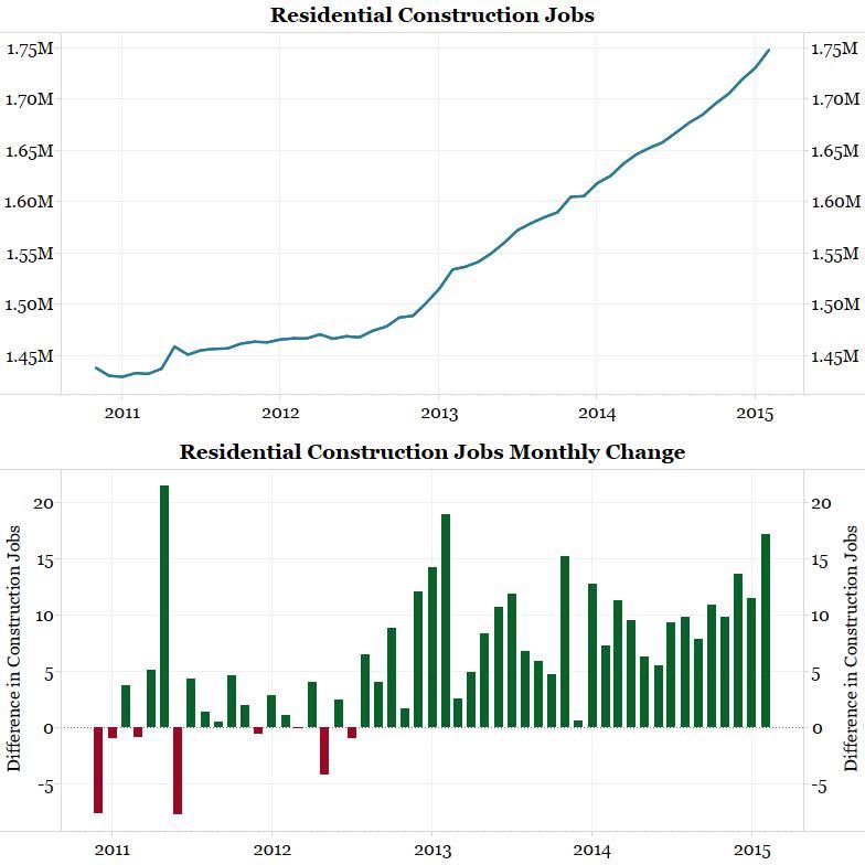
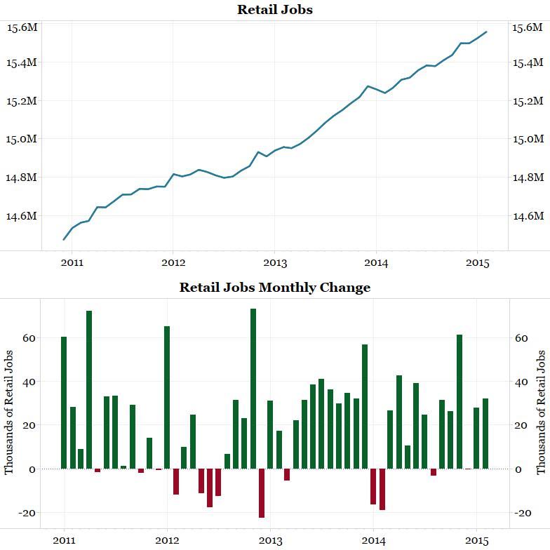
On top of productivity declining and the low level of the Atlanta Fed's GDPNow, the chart below shows industrial production has also fallen off a cliff. The narrative told by the charts above have led us to question why the jobs numbers have been so robust lately. Why are companies supposedly hiring at such a healthy pace in the face of slowing growth? As the chart below shows, manufacturing hiring is picking up nicely. As the red line in the chart below shows, housing starts also fell considerably from January to February. This has not affected residential construction job growth though. Note the chart below shows residential construction jobs grew by 17,200 in February. This is the second-best month of hiring since 2011. This number is seasonally adjusted. The unadjusted number grew by exactly 10,000. So what did these 10,000 new jobs do if far fewer homes were being built? The next two charts look closely at job growth in the retail sector. As the first chart shows, hiring has continued in this sector despite a slowdown in retail sales. Conclusion Job growth in manufacturing, residential construction and retailing accounted for almost a third of February's blow-out nonfarm payroll number. Are we to believe all these industries were hiring at such a healthy pace despite the decline in growth? If this is the case, the productivity numbers will continue to collapse and the Fed will have a serious problem on its hands. We, on the other hand, suspect something might be amiss with the payroll numbers. These numbers are telling a far different narrative from most other economic data. |
| Posted: 02 Apr 2015 04:30 AM PDT The news flow never stops, and neither does our braised, slow smoked morning train reads:
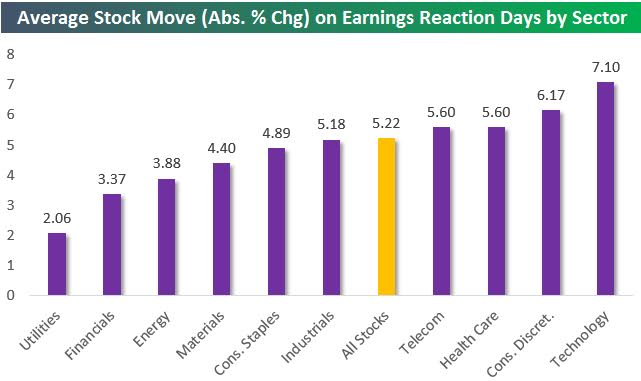
What are you reading? Continues here The Most Volatile Stocks On Earnings
|
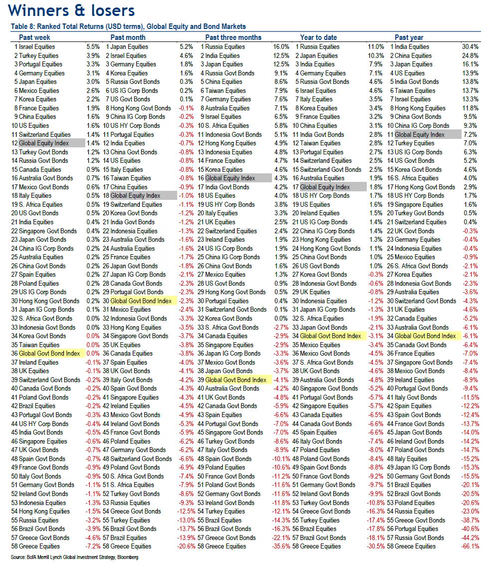
| Winners and Loser of the Global Financial Markets Posted: 02 Apr 2015 03:30 AM PDT
|


| You are subscribed to email updates from The Big Picture To stop receiving these emails, you may unsubscribe now. | Email delivery powered by Google |
| Google Inc., 1600 Amphitheatre Parkway, Mountain View, CA 94043, United States | |


0 comments:
Post a Comment