The Big Picture |
- Tuesday Reading List
- No end in sight to foreclosure quagmire
- Please Take My Money for a 1% Return Back
- Death Cab For Cutie’s “Home Is A Fire” Video
- Who’s Paying for the Eurozone Bailout?
- Citi’s Reverse Split
- A Bit of Healthcare Chart Porn
- Zombie Lie
- Import prices continue to spike
- Dates of Important Internet Launches
| Posted: 10 May 2011 01:00 PM PDT Some interesting reads for your reading pleasure:
What are you reading? |
| No end in sight to foreclosure quagmire Posted: 10 May 2011 12:17 PM PDT Horrifying, shocking story of abuse and deception by banks regarding modifications: The NBC News/MSNBC.com special report on the foreclosure crisis is now posted on the msnbc.com website. The posting includes four Lisa Myers video reports.
Part I Visit msnbc.com for breaking news, world news, and news about the economy ~~~ Part II Visit msnbc.com for breaking news, world news, and news about the economy ~~~ Visit msnbc.com for breaking news, world news, and news about the economy ~~~ Visit msnbc.com for breaking news, world news, and news about the economy |
| Please Take My Money for a 1% Return Back Posted: 10 May 2011 11:49 AM PDT The 3 yr note auction was good as the yield as about in line with the when issued but the bid to cover of 3.29 is the best since August and above the 12 month avg of 3.16. The US Treasury is certainly getting the gift of 1% financing costs for three years. Dealers also took the least amount since Jan thus leaving more in investor hands. This auction will be followed by the important 10 yr tomorrow and 30 yr on Thursday and as we all know, every day that goes by is one day closer to the end of Fed buying. Treasuries have certainly traded great of late and its due to concerns with economic growth as we close the chapter on QE2 and a large crutch gets taken away that was so supportive mostly to asset prices beginning in late August. |
| Death Cab For Cutie’s “Home Is A Fire” Video Posted: 10 May 2011 11:35 AM PDT Boing Boing premiered of Death Cab For Cutie’s “Home Is A Fire” music video, by artist Shepard Fairey and Death Cab bassist Nicholas Harmer. The song is from Death Cab for Cutie’s exquisite new album, Codes And Keys, available May 31, 2011 on Atlantic Records. Below, Shepard and Nick share their inspiration and thoughts on this perfect collaboration. ~~~ |
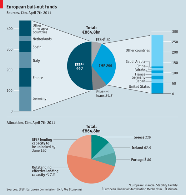
| Who’s Paying for the Eurozone Bailout? Posted: 10 May 2011 11:30 AM PDT Informative chart from The Economist, looking at exactly where funding is coming from for the various PIIGs bailouts. The total €865 billion ($1.2 trillion) pot available for euro-area rescues is rather enormous. (Whether it will be sufficient to cope with Greece, Ireland and Portugal's needs is yet to be determined). The sources of all that cash include the European Financial Stability Facility, (€440 billion) primarily funded by Germany, France and Italy. The IMF can kick in up to €280 billion. America has also suggested she will lend €50 billion.> |
| Posted: 10 May 2011 10:00 AM PDT Thoughts on Citi's Reverse Split:
Comment: The first story above points out that Citi accounted for 6.5% of NYSE composite volume last year. As we pointed out on April 6, the stock's reverse split would depress composite volume. Our chart below shows yesterday's volume (last red bar) was the lowest non-holiday volume since October 29, 2007. If the technicians were worried about the bearish implications of a rally with declining volume, this will only grow larger considering Citi's reverse split. FYI – Our data, calculated by Bloomberg (MVOLNU <index>), shows NYSE composite volume was 2.93 billion yesterday. The story above says NYSE composite volume was 3.03 billion shares. We are not sure what data source they used which might lead to this slight discrepancy. > Click on chart for larger image |
| A Bit of Healthcare Chart Porn Posted: 10 May 2011 08:30 AM PDT I’ve been tinkering with Google’s Fusion Tables (which are very cool and no relation to our host’s biz), and wondering how best to introduce a chart or two to TBP. BR’s recent post on healthcare gave me the perfect opening. So, herewith, the first of what I hope will be many Fusion Tables to come (hover over countries for data). First up, worldwide density of doctors per 10,000 population (these are doctors only; dentists, nurses, and other healthcare professionals are tallied separately). To spare you the trouble of searching, Cuba is #1 at 64, and Greece is #2 at 54; many countries are at one or less. Source: WHO Next up, total healthcare expenditures as a percent of GDP. There are additional aspects of this to explore (private expenditures, government expenditures, etc.), but I’ll leave that for another time in the interest of getting the overall picture out. Source: WHO You’ll probably not find #1 on the graphic above (at 17.9%), which is the only country ahead of the United States (at 16%). It is Niue, a speck of an island in the South Pacific (east of Fiji) no larger than a pixel or two on your screen. I love being able to visualize the data via Fusion Tables. The Tables themselves still seem to be a work-in-progress (still in Beta), and there are many improvements I hope Google makes, but its ability to import Excel data and manipulate is great. Which leads to this question: What would folks be interested in seeing via the Fusion Tables — suggestions should be either worldwide (rankings by nation) or specific to the United States (state-by-state). Of course, the data must be readily available and from reputable sources. Throw it in comments and I’ll see what I can do — if there’s one thing this crowd is long it’s imagination. |
| Posted: 10 May 2011 07:30 AM PDT
~~~ Example Citations:
This is an interesting Word Spy observation of a new grammatical idiom — a falsehood that will not go away. I guess Zombie Economics is a broad based application of Zombie Lies. See Supply Side is a perfect example of this. |
| Import prices continue to spike Posted: 10 May 2011 07:13 AM PDT Thanks to the weak US$, rising commodity prices and growing wage inflation in China, April import prices rose 2.2% m/o/m and are now up 11.1% y/o/y vs expectations of 1.8% and 10.4% respectively. It’s not just food and energy too as ex that prices were up .5% m/o/m led by a 5% rise in the cost of imported industrial supplies. Import prices from China rose .4% after a .6% gain in March and is up 2.8% y/o/y as the days of importing deflation from China is over. This data highlights clearly the inflationary implications of a weak US$ when we have a trade deficit as large as ours. The weak US$ certainly helps the export side in terms of competitiveness and revenues but we import a lot more than we export at an ever growing cost. |
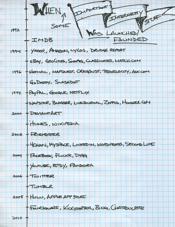
| Dates of Important Internet Launches Posted: 10 May 2011 06:37 AM PDT |
| You are subscribed to email updates from The Big Picture To stop receiving these emails, you may unsubscribe now. | Email delivery powered by Google |
| Google Inc., 20 West Kinzie, Chicago IL USA 60610 | |


 The Big Picture (ritholtz)


0 comments:
Post a Comment