


The Big Picture |
- Forget Tapering and Exit via Reserve Requirements
- The Art of Choosing
- 10 Tuesday PM Reads
- China’s Shadow Banking System
- Wall Street (Still) Lukewarm on Equities
- Gold Bouncing Towards $1400 Creates Selling Opportunity
- 10 Tuesday AM Reads
- Housing Affordability Index: Still Worthless
- Three Years of Sun in Three Minutes
| Forget Tapering and Exit via Reserve Requirements Posted: 03 Jul 2013 02:00 AM PDT Forget Tapering and Exit via Reserve Requirements
The market turmoil that followed the last FOMC meeting suggests it may be time for a primer on the relationships among the Federal Reserve's asset purchase program, its Federal Funds rate target policy, and its unconventional policy at the zero bound. What are these programs and how do they fit together? It turns out that they are more closely intertwined than the discussions so far have suggested. First, here are some basics. Classical supply and demand theory tells us that in a competitive market place policy makers can fix either a price or a quantity, but not both. Fixing a market's price means the quantities supplied and demanded will vary over time. Conversely, fixing the supply of a good in a market means that the market-clearing price will not be controlled. Fed policy to set the Federal Funds rate is designed to fix the price (interest rate) at which excess reserve deposits held at the Fed trade in the wholesale money market. This means that the Fed must purchase or sell assets, or engage in short term repurchase and reverse repurchase transactions, in order to add or subtract whatever reserves are needed to keep the short term Fed Funds rate within the FOMC's target range of 0–.25%. There is one minor technicality here: the Fed's price-setting mechanism isn't perfect because it doesn't stand ready either to buy or to sell reserves at its target rate throughout the day. But we should not let that small technical caveat distract us from the main points to be made. Now, what about the Fed's $85 billion/month asset-purchase program that is supposedly an unconventional policy tool? In one sense it is, and in another sense it isn't. When the Fed purchases long-term Treasuries or MBS in the marketplace, it pays for those assets by creating high-powered money in the form of deposits at Federal Reserve Banks. Therefore, as is true of the implementation of its Federal Funds target policy, the Fed is simply adding to the quantity of bank reserves. What is different is that the addition of reserves is not associated with its short-term Federal Funds target, but is instead focused on asset purchases of longer maturities in the Treasury and MBS markets. These purchases are continually adding reserves to the banking system and not adjusting them up or down on a day-to-day basis the way the Fed does in the overnight Federal Funds market. To date, most of the Fed's purchases have been almost exclusively in over-five-year maturities. By taking longer-maturity Treasuries and MBS out of the private-sector market, the prices of those securities have been increased, placing downward pressure on their interest rates. As distinct from the Fed’s specific target range for the short-term Federal Funds rate, the asset purchase program doesn't have a set target schedule of rates for the assets the Fed is buying; it is just attempting to put downward pressure on those rates and let them settle down at the then-new market-clearing rate. Considering the two policies together, the Fed is attempting to anchor the term structure near zero on the short end while forcing longer-term rates lower. The result is a highly distorted term structure at the moment. The Fed's asset purchase program is simply a flow component of the broader strategy it initiated much earlier in the financial crisis, when the Fed quickly built up its asset portfolio in an attempt to flood the market with liquidity and to stimulate lending. Notice, however, that the three strategies have a common feature in that they all involve the injection of high-powered money in the form of excess bank reserves. These excess reserves are the same funds that can exchange hands in the wholesale Fed Funds market. So what the Fed is doing through its asset purchase program is converting longer-term assets held by the private sector – Treasuries and MBS – into bank reserves that are short-term payable upon demand. This raises the following question: How can the Federal Reserve System Open Market Desk simultaneously adjust the volume of Federal Funds traded in the overnight money market to keep the target rate between 0 and .25% while at the same time continuously adding to excess reserve balances that could be traded in the wholesale money market generated through its asset purchase program? Shouldn't this continued flow of Fed Funds push the rate to zero? This is where the payment of interest on reserves comes in. Virtually none of the excess reserves available are actually traded in the overnight market, because they are effectively being sterilized by the fact that the Fed is currently paying interest on reserves at 25 basis points. That rate exceeds, by at least 15 basis points, the 10 basis points or so that a bank could earn by lending those funds in the overnight Federal Funds market. So where do the funds come from that are trading in the overnight market? We do know that two important sources are Freddie Mac and Fannie Mae. These institutions accumulate payments on the mortgages that are behind the MBS they have issued, and those payments temporarily are warehoused until they are disbursed each month to the holders of those MBS. Since Freddie and Fannie are not banks, they are not permitted to hold deposits at the Fed and cannot earn the 25 basis points available to banks. Instead, they lend those funds out in the overnight market at rates below the 25 basis points paid on bank reserves. It is far better for them to earn 10 basis points by lending accumulated deposits into the overnight market than to let those deposits sit idle earning zero. Who might the borrowers be? The answer is that any commercial bank would gladly borrow at 10 basis points in the overnight market and earn a 15 basis-point spread by holding reserves paying 25 basis points at the Fed. What we are observing is a risk-free arbitrage to the borrowing institutions and a wealth transfer from the Fed – and ultimately from US taxpayers – to the borrowing banks. The Fed seems convinced that its asset purchase program of $85 billion in injection of high-powered money is largely imperceptible at this point, in terms of its effects on interest rates. Hence, in the press conference following the last FOMC meeting it saw little risk in beginning to talk about scaling back the program. And its messages suggest that the Committee envisioned that a phased tapering in the program could proceed smoothly, with little market disruption. But this view ignores the interrelationship between asset purchases, bank reserves, the near-zero Fed Funds target, interest on reserves, and the risks facing bond managers who have a fiduciary responsibility to protect their clients’ net worth. Simply scaling back on the program in phases will start to ease upward pressure on asset prices as the largest marginal participant – the Federal Reserve – begins to exit the market. But the market doesn't know where on the term structure the effects will be most important, since these will depend on where the cutbacks occur relative to Treasury issuance of new securities. This lack of information and the uncertainty it creates is what was so disruptive to markets. Federal Reserve Bank of Richmond President Jeffrey Lacker put it correctly last week when he argued that volatility and uncertainty will be with markets for some time due to this possible change in Fed purchases. Extrapolating the exit problem forward to the time when the Fed will begin asset sales, the problems become even more difficult. Selling assets will clearly increase the supply on the market, lower asset prices, and raise yields. And how attractive those assets will be to potential buyers, who are mainly the holders of excess reserve balances, will depend upon the prices and maturities offered and on the attractiveness of those prices relative to the risk-free return of earning 25 basis points on reserves. How sales will be distributed across the term structure will radically affect both its shape and any price risks that potential buyers will face. Clearly any rational buyer will require a significant price risk premium, especially at the start of the program, to compensate for the eventual continual flow of asset sales and hence the serial decline in prices of any accumulated holdings of Treasuries. A decline in the price of any security when it is sold will also reduce the market value of any similar outstanding securities, whether they are sold or not. The Fed could couple asset sales with a change in the interest rate it offers on reserves, but it isn't clear that increasing the opportunity cost of holding excess reserves, for example, by reducing the rate paid on reserves in order to make Treasury purchases more attractive will be sufficient to induce institutions and buyers to lower the price risk premia they will demand. Finally, we haven't talked about how private-sector holders of outstanding Treasuries will respond to potential asset sales by the Fed. Clearly, the selloff that occurred last week at even the mere hint of a change in any part of the Fed's policy is a clue and should send a powerful signal to policy makers that their assumption that a smooth path exists is questionable. So what might the Fed do? Instead of spooking fixed-income markets with uncertain proposals for asset sales, they might opt for an obvious alternative, which we have put forth before. Raising reserve requirements to idle at least 90% or some other very high percentage of the excess reserves would eliminate the need for the Fed to sell assets. The Fed could couple that increase with a commitment (forward guidance) to lower reserve requirements as bank lending increases and the economy grows, but in a phased way that provides flexibility and accommodation to lending institutions, even as it eliminates the inflation risks associated with an unanticipated increase in the money supply and acceleration in bank lending and aggregate demand that increases the Fed's inflation forecasts. And doing so even before tapering its asset purchase program would send a strong message about what the exit path would look like. The increase in reserve requirements would be a nonevent for the affected institutions, since the reserves are not being used to support lending, and banks would continue to earn a 25-basis-point return on their total reserve positions. The Fed might even commit to increase that payment in line with movements in market rates. Critics might argue that an across-the-board increase in reserve requirements would unfairly impact smaller community banks, but the Fed has the legal authority to impose differential reserve requirements and has done so in the past. It could tailor the reserve requirement structure to avoid unduly constraining certain classes of institutions. Finally, by going the reserve requirement route, the Fed would buy the needed time to allow its existing asset holdings to run off, thereby eliminating the threat of asset sales and undue price risks to debt markets. It could then gradually return to its interest-rate targeting regime. Bob Eisenbeis, Vice Chairman & Chief Monetary Economist ~~~ Bob Eisenbeis is Cumberland's Vice Chairman & Chief Monetary Economist. Prior to joining Cumberland Advisors he was the Executive Vice President and Director of Research at the Federal Reserve Bank of Atlanta. Bob is presently a member of the U.S. Shadow Financial Regulatory Committee and the Financial Economist Roundtable. His bio is found at www.cumber.com. He may be reached at Bob.Eisenbeis-at-cumber-dot-com. |
| Posted: 02 Jul 2013 05:00 PM PDT The art of choosing Sheena Iyengar studies how we make choices — and how we feel about the choices we make. At TEDGlobal, she talks about both trivial choices (Coke v. Pepsi) and profound ones, and shares her groundbreaking research that has uncovered some surprising attitudes about our decisions. ~~~ How to make choosing easier We all want customized experiences and products — but when faced with 700 options, consumers freeze up. With fascinating new research, Sheena Iyengar demonstrates how businesses (and others) can improve the experience of choosing. |
| Posted: 02 Jul 2013 01:30 PM PDT My by-the-time-you-read-this,-I’ll-be-in-the-Hamptons afternoon reads:
What are you reading?
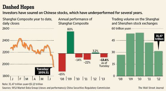
Weak Links Mar Investing in China |
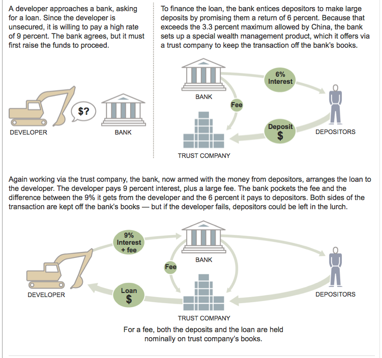
| Posted: 02 Jul 2013 12:00 PM PDT Hey! Its not just the USA that has a crappy shadow banking system — China does too!
click for larger graphic
|
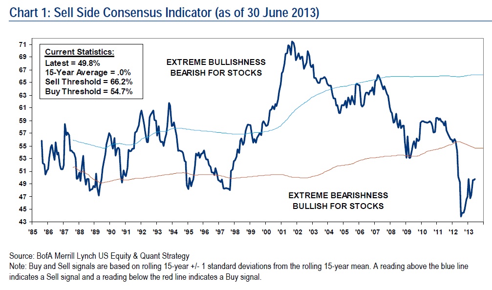
| Wall Street (Still) Lukewarm on Equities Posted: 02 Jul 2013 10:00 AM PDT Click to enlarge
Merrill Lynch continues to point out that the Street remains unenthusiastic about stocks:
Very interesting stuff . . .
Source: |
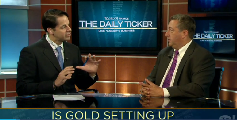
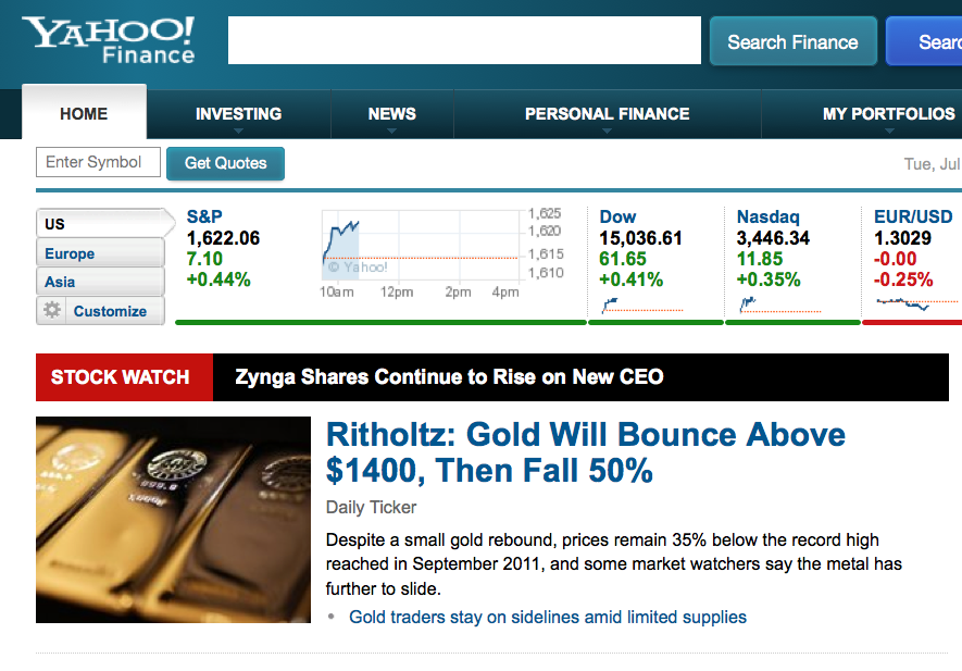
| Gold Bouncing Towards $1400 Creates Selling Opportunity Posted: 02 Jul 2013 08:30 AM PDT This discussion is about probabilities and investor psychology — not predictions.
Click for video Source: Yahoo Finance
Note: I understand getting heard above the clutter and attracting clicks and all, but this headline is rather different than what we actually discuss on the video above:
|
| Posted: 02 Jul 2013 07:00 AM PDT My morning reads:
What are you reading?
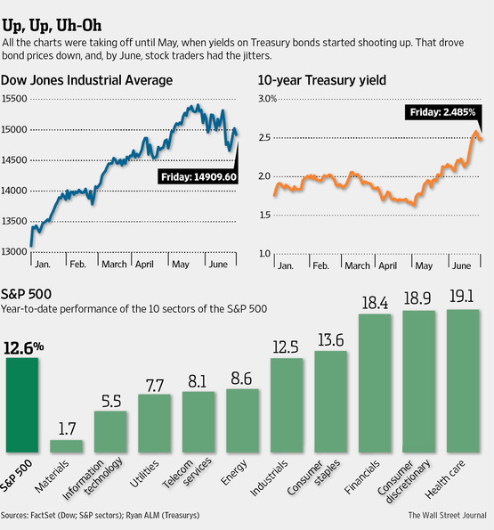
At Midyear, Market Is More Jittery, Less Optimistic |
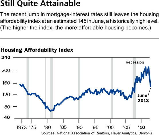
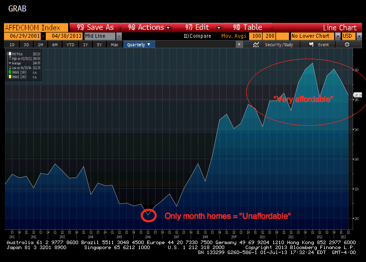
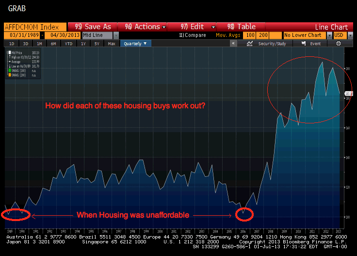
| Housing Affordability Index: Still Worthless Posted: 02 Jul 2013 05:00 AM PDT In the past, we have discussed how worthless the NAR’s Housing Affordability Index is. This weekend saw an odd column in Barron’s that was suckered in by the silliness of that index. This suggests to me it is time to take another pass showing exactly why this index has so little value to anyone tracking housing values and affordability. let’s begin by going back to our 2008 analysis:
That’s not the worst of it — during the huge run up from 2001-2007, there was but one month — ONLY ONE MONTH! — where the NAR said homes were no affordable!
Only One Month When NAR Said Homes Were Not Affordable
With that absurdity established, let’s look at what The Sunny Side of Higher Interest Rates had to say. Not surprisingly, base don this silly index, they concluded that homes are still very affordable:
Let’s delve a little deeper into what does and does not go into the Home Affordability Index. According to the NAR:
So it assumes a down payment. The reality is that about 44% of those homeowners with mortgages have little equity, no equity or negative equity, according to Zillow. This is much higher than historical averages, thus putting this assumption at risk Hence, this key distinction gets ignored by the NAR in the the way they frame the question and make erroneous assumptions. The issue is not whether homes are affordable, but rather “Can American families afford homes?” As we have seen, not especially. Indeed, the buyers of many of the properties in recent quarters have not been families, but rather, huge pools of private equity, whose business model seems to be Buy-to-Rent-to-Flip. At the Pew Conference on Housing in DC last summer, attendees at Sheila Bair’s event estimated this pool of PE money was north of $25 billion dollars. To show you just how ridiculous this datapoint is, let’s take a closer look at the series. Here is the 10 Year Housing Affordability Index:
When Housing Was and Was Not Affordable
Looking even longer term — 1989 to present – shows just how absurd the index is: NAR HAI 1989-2013
1989 followed a series of rate cuts after 1987 crash. In NYC, if you bought a home then,m you did not get back to break even in the value to ~1996. Bu the home was affordable, just not a good intermediate term investment. And, this was in the midst of an 18 year bull market, with relatively plentiful jobs and credit availability. Same Unaffordable rating for 2006 with very different circumstances. Should the NAR HAI be renamed? It seems to be better suited to telling you if a house is a good investment than if its affordable! I still do not take the NAR’s Housing Affordability Index very seriously . . .
Previously: Home Affordability Reality Check (April 3rd, 2012)
Source: |
| Three Years of Sun in Three Minutes Posted: 02 Jul 2013 03:00 AM PDT In the three years since it first provided images of the sun in the spring of 2010, NASA’s Solar Dynamics Observatory (SDO) has had virtually unbroken coverage of the sun’s rise toward solar maximum, the peak of solar activity in its regular 11-year cycle. This video shows those three years of the sun at a pace of two images per day. SDO’s Atmospheric Imaging Assembly (AIA) captures a shot of the sun every 12 seconds in 10 different wavelengths. The images shown here are based on a wavelength of 171 Angstroms, which is in the extreme ultraviolet range and shows solar material at around 600,000 Kelvin. In this wavelength it is easy to see the sun’s 25-day rotation as well as how solar activity has increased over three years. During the course of the video, the sun subtly increases and decreases in apparent size. This is because the distance between the SDO spacecraft and the sun varies over time. The image is, however, remarkably consistent and stable despite the fact that SDO orbits the Earth at 6,876 miles per hour and the Earth orbits the sun at 67,062 miles per hour. Such stability is crucial for scientists, who use SDO to learn more about our closest star. These images have regularly caught solar flares and coronal mass ejections in the act, types of space weather that can send radiation and solar material toward Earth and interfere with satellites in space. SDO’s glimpses into the violent dance on the sun help scientists understand what causes these giant explosions — with the hopes of some day improving our ability to predict this space weather. There are several noteworthy events that appear briefly in this video. They include the two partial eclipses of the sun by the moon, two roll maneuvers, the largest flare of this solar cycle, comet Lovejoy, and the transit of Venus. The specific time for each event is listed below, but a sharp-eyed observer may see some while the video is playing.
Hat tip kottke Music: “A Lady’s Errand of Love” – composed and performed by Martin Lass 00:30;24 Partial eclipse by the moon 00:31;16 Roll maneuver 01:11;02 August 9, 2011 X6.9 Flare, currently the largest of this solar cycle 01:28;07 Comet Lovejoy, December 15, 2011 01:42;29 Roll Maneuver 01:51;07 Transit of Venus, June 5, 2012 02:28;13 Partial eclipse by the moon More information about this video, as well as full HD version of all four wavelengths and print-resolution stills are public domain and can be viewed and downloaded at: http://svs.gsfc.nasa.gov/vis/a010000/… This video is public domain and can be downloaded. Subscribe to NASA’s Goddard Shorts HD podcast: http://svs.gsfc.nasa.gov/vis/iTunes/f… Or find us on Twitter: http://twitter.com/NASAGoddard |

| You are subscribed to email updates from The Big Picture To stop receiving these emails, you may unsubscribe now. | Email delivery powered by Google |
| Google Inc., 20 West Kinzie, Chicago IL USA 60610 | |


0 comments:
Post a Comment