


The Big Picture |
- Quarantine
- The Instagram Generation
- 10 Tuesday PM Reads
- Goldbugs Push Back
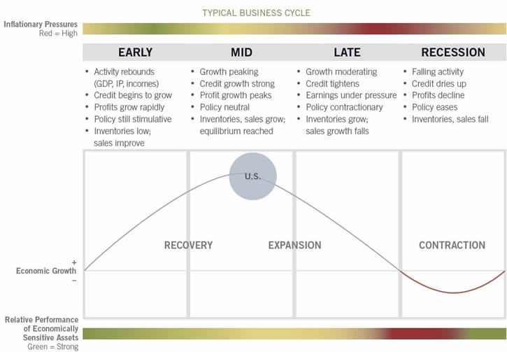
- Business Cycle Chart
- NDR: 1980s Gold Pattern Suggests $660/oz
- 10 Tuesday AM Reads
- Income Inequality and Income-Class Consumption Patterns
| Posted: 08 Oct 2014 02:00 AM PDT Quarantine
"The practice of quarantine, as we know it, began during the 14th century in an effort to protect coastal cities from plague epidemics. Ships arriving in Venice from infected ports were required to sit at anchor for 40 days before landing. This practice, called quarantine, was derived from the Italian words quaranta giorni, which mean 40 days." (Centers for Disease Control and Prevention) The modern world is now moving toward a full Ebola quarantine. I personally recall flying home from Europe in the 1960s while I was in the US Army. The plane was diverted to the Azores, and while it was refueled, the military passengers (mostly US Navy submariners) were released into the Azores for a few hours of shore leave. The commanders were not aware that a virus was loose in the Azores. When we reboarded the plane and subsequently learned of the virus, we also learned that we would be diverted once we reached the US. We had to sit on a runway in Rhode Island and wait for the US health authorities to inspect the plane. They tested everyone on it and held us while they observed whether the virus had run its course. Quarantines are a pain in the neck. They are also necessary to isolate viruses and break the chain of transmission. We see in modern countries with mature economies and functioning health systems that the use of quarantine is understood and is being implemented now in response to Ebola. The scares in Spain and Texas will ratchet up the level of quarantine. The period of 21 days will become a well-known time measurement. In this morning's edition of The Gartman Letter, Dennis Gartman listed the assorted plagues that have claimed countless lives during the last many centuries. It is a terrific summary and helps develop perspective. We tend to focus on the isolated case and not think about the system. It is scary to watch modern media portray viral spread and resultant death. We are concerned for good reason.
A historical perspective is necessary as we consider how best to address the Ebola threat. Quarantine in St. Louis, Missouri, prevented the spread of Asian Flu (H1N1) during the 1918 epidemic. In Philadelphia, Pennsylvania, there was no quarantine in effect, and the virus was deadly and spread quickly there. People felt healthy on their way into work in the morning and were dead by afternoon. We are worried about Ebola and how it will impact economic activity. It is human nature to defend ourselves and our loved ones, and quarantine is a form of self-defense. Defense against any illness, especially one that is viral, requires putting up barriers between yourself and others. Governments and businesses that have the ability to institute rules and barriers in response to Ebola will do so. At Cumberland Advisors, we ask our staff not to come to the office if they have any symptoms of illness. We install electronic equipment so that they can work from home while maintaining a personal quarantine. We believe millions of other business enterprises do the same. Ebola will shrink economic activity to some extent. The impact could be major or it could be minor, but there will be a price to pay for this virus, as there is for every natural phenomenon that has destructive characteristics. We thank Dennis Gartman for giving us permission this morning to reproduce his viral history for all to consider. We agree with Dennis: concern, caution, and quarantine are warranted. Hysteria is not.
~~~ David R. Kotok, Chairman and Chief Investment Officer, Cumberland Advisors |
| Posted: 07 Oct 2014 05:00 PM PDT “The ‘Instagram Generation’ now experiences the present as an anticipated memory”
|
| Posted: 07 Oct 2014 02:30 PM PDT My afternoon train reads:
What are you reading?
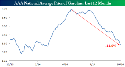
Gas Prices Down 11% From YTD Highs
|
| Posted: 07 Oct 2014 11:30 AM PDT
Whenever I write about Gold, the pushback is always robust. Yesterday's column How Low Can Gold Go? was no different. As a public service, I thought I would address the feedback, criticisms and complaints amongst the many emails and comments I received. Some of the commentary was worthwhile discussions related to investing in general and precious metals in particular. These insightful souls seem to always generate inspiring food for thought. Their comments help me clarify my thinking on trading and commodities. Unfortunately, those folks are the exception. The bulk of the pushback comes from people who have been long and wrong, and refuse to hear from any source suggesting they are on a bas trade. The attitude seemed to be along the lines of "Who are you going to believe, me or my lying P&L? Quite an astonishing collection of denial Before we continue, one quick note to commenters: It is astonishingly easy to tell when a commenter did not read the column and is merely responding to the headline, which is typically written by an editor. Believe me, after 30,000 blog posts, you can tell at a glance which comments had nothing whatsoever to do with your column. Note original comments/emails are in italics, and my comments follow: On to the pushback:
|
| Posted: 07 Oct 2014 08:30 AM PDT |
| NDR: 1980s Gold Pattern Suggests $660/oz Posted: 07 Oct 2014 05:30 AM PDT Gold is one of those topics that always generates fierce pushback whenever I write about it. Yesterday's column How Low Can Gold Go? was no different. A deluge of emails and over 150 comments soon followed. I may post some of the more informative, vociferous and misguided comments / emails from readers later today as a public service to everyone else. But note that I find this pushback highly encouraging, as it suggests a topic that not only resonates, but is a hot button emotional issue. The lack of rationality is obviously so dangerous for investors. These last two make the subject especially intriguing to me. One more thing: As it turns out, I am not the only one who has been skeptical on Gold since its uptrend cracked late in 2010. This weekend’s Barron’s, citing Ned Davis Research, excerpted part of a recent research report from John LaForge and Warren Pies of NDR on historical gold cycles:
Feel free to take the other side of the trade from what is widely regarded as the most astute technical analysis firm in the world . . .
|
| Posted: 07 Oct 2014 05:00 AM PDT Good Nobel morning to you. No worries if you did not get a phone call from Stockholm, we still have a prize awaiting you: your morning train reading! :
|
| Income Inequality and Income-Class Consumption Patterns Posted: 07 Oct 2014 02:30 AM PDT Economic Commentary Income Inequality and Income-Class Consumption Patterns
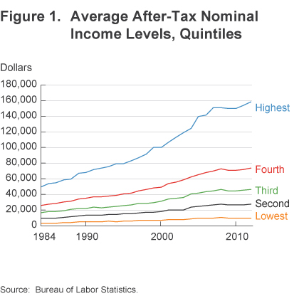
As income inequality has increased in the United States, researchers have rightfully asked whether it has also led to inequality in relative consumption. This is an important question because consumption is clearly a better measure of an individual's well-being than is his or her income. The research findings on the presence of consumption inequality, however, remain somewhat mixed. Many studies have found that consumption inequality has risen less than income inequality in recent decades (Cutler and Katz 1991, Krueger and Perri 2006, Heathcote et al. 2010, Fisher, Johnson and Smeeding 2013, Meyer and Sullivan 2013), while others have found that the rise has been fairly similar (Aguiar and Bils 2012, Attanasio, Hurst and Pistaferri 2013). Despite this divergence in findings, it would be useful to know whether the consumption patterns of individuals in different income classes have been reordered over the same period that income inequality has increased. In this Commentary I introduce a metric for distinguishing luxuries and necessities in consumption data produced by the Bureau of Economic Analysis and use it to reveal trend changes in consumption patterns for different income classes over the past three decades. I find that for lower and middle income quintiles, the share of total inflation-adjusted (real) consumption going to purchase necessities has contracted since 1984, while the share of the total going to purchase luxuries has remained fairly constant or slightly increased. For the highest income quintile, however, there has been growth in the relative consumption of luxuries. Income Inequality, Inflation, and ConsumptionMuch has been written regarding the growing disparity between the wealthiest and poorest Americans in the aftermath of the Great Recession. While average income has returned to pre-recession levels, income gains have been distributed unevenly. To gain insight into the evolution and distribution of income in the United States, economic researchers often delineate the population into income cohorts known as "quintiles." Households are divided into quintiles according to their gross income. Each quintile represents 20 percent, or one-fifth, of all households. The data show that the top 20 percent of earners accounted for more than 80 percent of the rise in household income from 2008-2012 (figure 1). Meanwhile, incomes actually fell for the bottom 20 percent of earners. For example, data obtained from the Bureau of Labor Statistics' Consumer Expenditure Survey show that the highest income quintile in the US experienced an increase in nominal income of approximately $7,100 between 2007 and 2012, while the lowest income quintile experience a decline of approximately $360. All of these changes in income had a direct impact on spending.
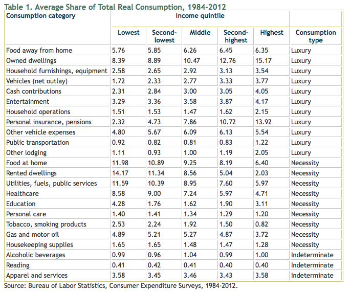
Because of the significant changes in the rate of income growth by income class over the last few decades, the consumption patterns of different income classes may also have changed. Such changes are caused by myriad factors, but one way of thinking about them is in terms of income and substitution effects (which comes from the theory of microeconomics). The income effect states that as consumers' incomes rise, their consumption will also increase, up until a point of satiation, while the substitution effect states that consumers' consumption patterns are affected by changes in the relative prices of goods (that is, as prices rise for a given good, consumers will reduce their consumption of that good where possible and increase their consumption of a substitutable good that provides them a comparable level of satisfaction). Since 1984, price inflation for consumer goods, as measured by the Bureau of Economic Analysis' Personal Consumption Expenditure Index, rose at a very moderate average rate of 2.4 percent annually. As one becomes wealthier on a real dollar basis, it is reasonable to assume that one would substitute away from goods and services considered necessities and toward those considered luxuries. To the extent that a person's income growth continues to exceed the rate of growth in prices, we would expect to see this shift toward relative luxuries magnified over the long run. Using these principles as backdrops, we turn to the question of how consumption patterns have changed among income quintiles as income growth changed, coupled with continuing changes in the prices of goods. More specifically, have there been shifts in peoples' relative consumption of necessity and luxury goods as some quintiles have prospered while others have experienced slow income growth? Defining Luxuries and NecessitiesThere is no clear-cut way of classifying goods and services as luxuries or necessities. Any classification is subjective at best and inconsistent at worst. What is a luxury item to one individual—such as an owned dwelling when rental dwellings of comparable quality are available at lesser cost—might reasonably be classified as a necessity to another—such as an owned dwelling when no rental properties of comparable quality are available. This subjectivity makes it impossible to sum the relative utility of various goods and services across individuals. However, by assuming that this variation cancels out across a large number of people in similarly classified income groups, a good or service can be consistently classified as a necessity or luxury within a given cohort by observing the shares of consumption. I employ an empirical classification method to construct a metric for classifying goods and services as luxuries or necessities. I start with one possible definition of a "luxury" as a good or service that is consumed in greater proportions as a person's income increases. By the same token, a necessity would be a good or service whose consumption is proportionately less as a person's absolute income increases. I use this definition to classify categories of expenditures as luxuries or necessities based on whether their share of consumption increases or decreases as income increases (table 1).
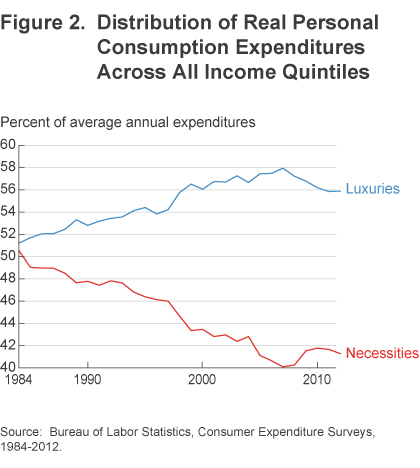
To identify which categories of expenditures are consumed in greater or smaller proportions as income rises, I analyze US consumption data from the annual Bureau of Labor Statistics' Consumer Expenditure Survey series. The Consumer Expenditure Survey (CES) program consists of two surveys, the Quarterly Interview Survey and the Diary Survey, which provide information on the buying habits of American consumers, including data on their expenditures, income, and characteristics of their consumer unit (families and single consumers). The US Census Bureau has collected the survey data for the Bureau of Labor Statistics on an annual basis beginning in 1984. Data for the survey years 1984 through 2012 were organized by income quintile, and for each of the income quintiles, average annual nominal levels of consumption for 23 categories of expenditures were identified. Price level deflators from the Bureau of Economic Statistics were used to convert the nominal values to real. All price-related references in the analysis relate to 2009 price levels. The categories included account for 94.9 percent of the average personal consumption basket for the years 1984-2012.1 The results of this analysis show how the shares of different categories of real consumption, averaged across the analysis period 1984-2012, change as income moves from the lowest income quintile to the highest income quintile. The classification in the final column, "relative consumption type," results from this researcher's method.2 A specific type of good or service is classified as a luxury if more of it is consumed, on a percentage basis, as real income levels increase (that is, going from lower to higher income quintiles). Similarly, a specific good or service is classified as a necessity if it accounts for a smaller percentage of consumption as real income levels increase. Changes in ConsumptionUsing this method to sort the data into luxuries and necessities reveals that across all income categories, the consumption of goods and services classified as necessities declined from 1984 to 2012, dropping from 45.7 percent to 36.7 percent (figure 2). Likewise, the average consumption share across all income categories rose for items classified as luxuries over the same time period, from 51.0 percent to 56.0 percent. While this trend movement is similar across the various income quintiles, it is nowhere near consistent. For example, consumers in the lowest income quintile reduced their consumption of goods and services classified as relative necessities from 63.5 percent in 1984 to 54.5 percent in 2012. Consumers in the highest income quintile saw their consumption of necessities decline from 33.8 percent to 27.7 percent.
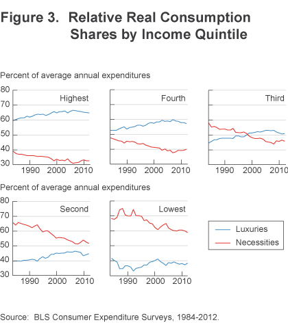
These results show that consumers have, in general, significantly increased their consumption of luxuries over the last 30 years as their real income levels increased. Recently, however, as figure 2 illustrates, this pattern reversed, as incomes suffered during the recent period of recession and recovery. Since 2007, the year in which the Great Recession started, the consumption of luxuries declined and only recently began to stabilize in 2012. Likewise, the consumption of necessity items began to rise in 2007 and slowed in 2012. As figure 3 illustrates, the relative consumption shares of luxuries and necessities vary greatly between income groups. From the different graphs one can see that, as the income level increases, luxury items account for a greater share of the consumer's market basket. While it is true that all income groups reduced their consumption of necessities over the analysis period, the rate at which they transitioned into consuming greater amounts of luxuries differed greatly across groups. As the results in both table 1 and figure 3 detail, the lowest and highest income quintiles were the most invariant over time with respect to their consumption of luxury goods. Middle income consumers experienced the greatest variation of all the groups. Their consumption of necessities declined by 12.2 percentage points over the analysis period, while their consumption of luxuries increased the most—rising by 6.2 percentage points.
Source:Federal Reserve Bank of Cleveland
ImplicationsIf income growth continues to lag for lower to middle income groups, two potential long-term implications for future economic growth come to mind. First, while consumption has gradually been rebounding from the recession, current trends in both income growth and income inequality are altering the mix of goods and services that consumers are purchasing. While macroeconomic models tend to focus on average income effects, there may useful information in the disaggregated patterns. Second, to the extent that consumption of the necessity "education" continues to decline as a share of real consumption for all but the highest income quintile, it may exacerbate the income inequality trend over the coming years; increased education is one of the most reliable paths to increased income. However, the lowest, second-lowest, middle, and second-highest income quintiles have all seen their shares of education decline significantly over the analysis period (8.1 to 2.6 percent, 2.8 to 1.2 percent, 2.5 to 1.1 percent, and 2.6 to 1.6 percent, respectively). The highest income quintile has seen its share of education consumption remain relatively steady, declining only slightly from 3.4 to 3.2 percent. Footnotes
ReferencesAguiar, Mark and Mark Bils, 2011. "Has Consumption Inequality Mirrored Income Inequality?" NBER Working Paper no. 16807. Attanasio, Hurst and Pistaferri, 2012. "The Evolution of Income, Consumption, and Leisure Inequality in the US, 1980-2010," NBER Working Paper no. 17982. David M. Cutler and Lawrence F. Katz, 1992. "Rising Inequality? Changes in the Distribution of Income and Consumption in the 1980s," NBER Working Paper no. 3964. Fisher, Jonathan D., David S. Johnson, and Timothy M. Smeeding, 2013. "Measuring the Trends in Inequality of Individuals and Families: Income and Consumption." American Economic Review, 103(3).Heathcote, Jonathan, Fabrizio Perri, and Giovanni L. Violante, 2010. "Unequal We Stand: An Empirical Analysis of Economic Inequality in the United States 1967-2006." Review of Economic Dynamics, 13. Krueger, Dirk & Fabrizio Perri (2006), "Does Income Inequality Lead to Consumption Inequality? Evidence and Theory," Review of Economic Studies, Wiley Blackwell, 73(1). Meyer, Bruce D., and James X. Sullivan, 2013, "Consumption and Income Inequality and the Great Recession." American Economic Review, 103(3). ~~~ LaVaughn M. Henry |Vice President and Senior Regional Officer for the Cincinnati Branch  LaVaughn M. Henry is a vice president and the senior regional officer for the Federal Reserve Bank of Cleveland's Cincinnati Branch. Dr. Henry is responsible for building and maintaining a strong presence and reputation for the Bank throughout central and southern Ohio, and eastern Kentucky. He works closely with key stakeholders, including the board of directors of the Cincinnati Branch, business advisory councils, depository institutions, business and civic leaders, and the public.
|
| You are subscribed to email updates from The Big Picture To stop receiving these emails, you may unsubscribe now. | Email delivery powered by Google |
| Google Inc., 20 West Kinzie, Chicago IL USA 60610 | |


0 comments:
Post a Comment