


The Big Picture |

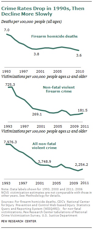
- Gun Homicide Rate Down 49% Since 1993 Peak
- 10 Tuesday PM Reads
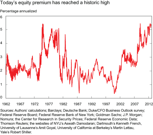
- Equity Risk Premium is High (this is bullish)
- 10 Tuesday AM Reads
- Appaloosa’s Tepper Bullish on Stocks (Still)
- Most Human Males Never Retired (they just died)
- The Next iPhone OS
- Crises Before and After the Creation of the Fed
| Gun Homicide Rate Down 49% Since 1993 Peak Posted: 14 May 2013 04:30 PM PDT Click to enlarge Source: Pew Research
I frequently find most of the arguments used by the pro gun side against standard background checks or reduced size magazines to be mostly silly and emotional. There are numerous simple things we can do to reduce deaths, accidental or otherwise. There are no legitimate arguments, only paranoid ravings of the deluded. However, this data point via Pew Research is quite astonishing — I’d imagine that most of the public on both sides of the gun control/21nd Amendment debate are mostly unaware:
Quite fascinating. The takeaway to me is that we as a society all should be doing more of what works to make all of us safer, freer, healthier — and continuously looking for ways to improve on that. ~~~ Discuss. |
| Posted: 14 May 2013 01:30 PM PDT My afternoon traffic court reads:
What are you reading?
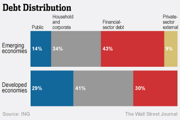
Debt Distribution |
| Equity Risk Premium is High (this is bullish) Posted: 14 May 2013 09:00 AM PDT
Last week, I posted the above chart from the NY Fed’s Liberty Street Economics. This morning on Squawk Box, David Tepper of Appaloosa discussed it — and his comments reversed the futures from negative to positive. Here is a brief explanation of what this chart — a compilation of 29 valuation models — means:
If you look at the chart, we are at levels that are similar to 1975 and 1982. An emailer last week asked me why I “waste space” occasionally publishing Fed research, academic papers and other such works. Now you know why . . .
Previously: Appaloosa's Tepper Bullish on Stocks (Still) (May 14th, 2013)
|
| Posted: 14 May 2013 06:45 AM PDT My morning reads:
What are you reading?
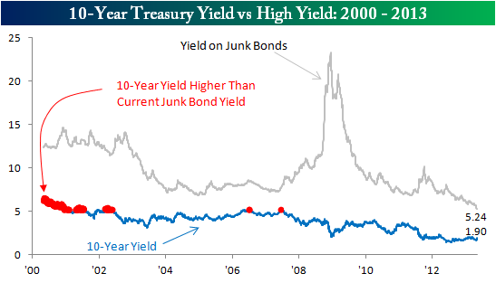
Junk Yields Less Than Treasuries Five Years Ago |
| Appaloosa’s Tepper Bullish on Stocks (Still) Posted: 14 May 2013 06:00 AM PDT click for Video |
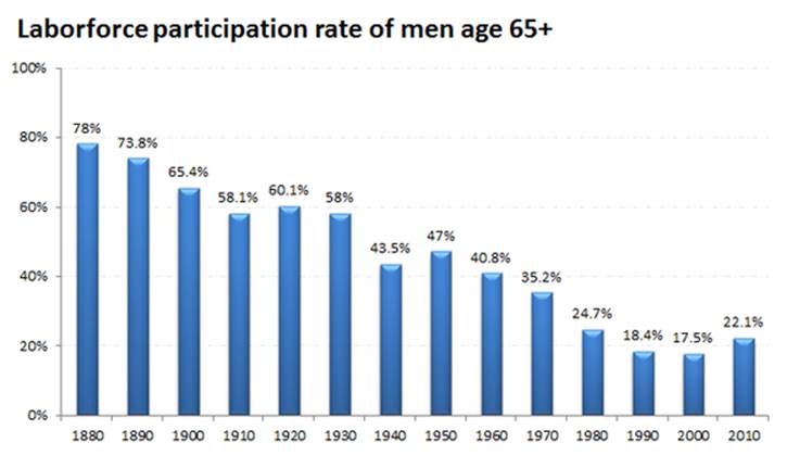
| Most Human Males Never Retired (they just died) Posted: 14 May 2013 04:58 AM PDT Click to enlarge
I was reminded of this over the weekend when I finally got around to reading a post of his on the flight back from the West Coast. The chart above is from a longer piece on savings for retirement — and we all know all the usual memes on that subject all to well. But here is the crazy thing we often forget: Throughout history, most people never really got to retired. Men typically were working at age 65 and beyond. In 1880, 78% of Men over the age of 65 were still working. Most men worked til they dropped. Only recently — since the 1940s — have less than a majority of over 65 year old men not been employed in some capacity. That is an astonishing data point. Retirement as we know it today is a less than century old phenomena. The truth of the matter is that most Humans (particularly males) never had the opportunity to retire. They simply worked until they died. You could not work, but then you wouldn’t eat — leading to the same resolution. The combination of Social Security, private pension funds, IRAs and 401(ks) are the funding mechanisms. They are quite imperfect, but what they require is tweaking, not undoing. Raise the FICA cap on Social Security, and that becomes financially sound. In IRAs and 401(k)s, you can replace high cost under-performing active funds with low cost passive ETFs and see an immediate improvement in returns. There are simple fixes for what are essentially actuarial issues. One last thing: Note that after 120 years of the labor force participation rate dropping for the over 65 male, it has begun ticking up again. The key question is whether this is merely a post-crisis catch up caused by 3 crashes — Stocks, houses & stocks again — or whether it represents a fundamental change in society. We probably won’t know for another 5 years or so, but it is worth watching closely.
Source: |
| Posted: 14 May 2013 04:00 AM PDT Simply Zesty rounded up assorted rumors of what the next iPhone OS might be, and created a surprising video. Here it is:
Video after the jump
Concept designs for iOS 7 , Created by our Art Director Philip Joyce and Motion Designer Denes Farkas, they wanted to offer a new vision for Apple, believing that its current designs have become stale, and so created this.
|
| Crises Before and After the Creation of the Fed Posted: 14 May 2013 02:30 AM PDT |


| You are subscribed to email updates from The Big Picture To stop receiving these emails, you may unsubscribe now. | Email delivery powered by Google |
| Google Inc., 20 West Kinzie, Chicago IL USA 60610 | |


0 comments:
Post a Comment