The Big Picture |
- The Rumble 2012: Bill O’Reilly / Jon Stewart Debate
- Update: Redesign, Adverts
- Addressing the BLS Truther Controversy
- Movement in Jobs Market
- GMO’s James Montier on European Challenges
- 10 Sunday Reads
- comediansincarsgettingcoffee: Quinn & Joyner
- What’s Your Biggest Fund Investing Error?
| The Rumble 2012: Bill O’Reilly / Jon Stewart Debate Posted: 07 Oct 2012 07:50 PM PDT Last night’s Bill O’Reilly/Jon Stewart debate, the “Rumble in the Air-Conditioned Auditorium,” just crushed it. This is the best 90 minutes of video you’re gonna see this month, and is unquestionably the best presidential debate of the season. |
| Posted: 07 Oct 2012 05:00 PM PDT Over the past few months, I mentioned a few times that I was overdue to replace this aging four year old layout. I wanted something faster, cleaner, and more modern. I really like the way the new design is coming together. The main body part is a neat solution to the issue of the old school Tab design. The idea behind tabs was a) to keep the slower loading video, flash and non investing posts, as well as other people’s writings, in a separate area. It worked, but its less than ideal. The newer design language works simply and beautifully. I am still wrestling with what the header will look like, and whether to keep my TBP logo and/or tag line. And a background — what do I do with that? Anyway, I like the way this is developing, and should be ready in a few weeks. ~~~ Second, you may have noticed a variety of new ads running. I am introducing a new ad network into the mix that has a heavier emphasis on financially related advertisers. It will take a few weeks for their algos to get a read of our content and become more contextual. You may also be seeing a lot of Google Adsense adverts, especially all those Romney and Obama adverts. The nice thing about Adsense from a reader perspective is you can mute any advertisement — that grey box in the top right of each ad will kill any ad. I despise the text ads — they are not only ugly, they are a compliance headache. I expect they will go the way of the dodo sooner rather than later. |
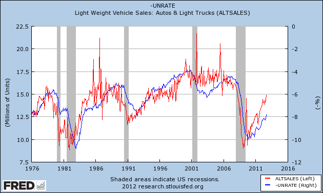
| Addressing the BLS Truther Controversy Posted: 07 Oct 2012 12:00 PM PDT @TBPInvictus Friday’s BLS truther controversy was, in a word, sad. That folks now nonchalantly float claims that government agencies fudge numbers is (or should be) beyond the pale (just as it was in 1970 when Nixon did it). But it’s not. While the truther discussion has made its way into every nook and cranny of the interwebs, maybe it would be instructive to take a look at some anecdotal information that supports Friday’s allegedly contrived unemployment number. Business Insider’s Joe Weisenthal suggested early Friday that the numbers we’d gotten earlier last week on auto sales foretold a decent jobs/unemployment number, which sent me scurrying to FRED to produce a chart:
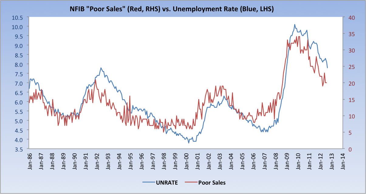
The pattern of auto sales leading the unemployment rate is crystal clear. Great call, Joe. So, the same folks who are skeptical of the BLS must necessarily also question the sales reports of GM, Ford, Toyota, Honda, BMW, and every other car manufacturer that reports monthly sales figures (i.e. all of them). Another piece of anecdotal information that I’ve used for years now is the NFIB’s “Poor Sales” (as Single Biggest Problem) vs. the Unemployment Rate:
As of the NFIB’s most recent report, Poor Sales was cited by 20 percent of businesses as their Single Biggest Problem in their Small Business Economic Trends report. Finally, the BLS itself goes to great pains to be transparent, and does a good job doing so. Earlier this year, their Editor’s Desk column ran a piece titled Employment Trends From Two Surveys, which very broadly discussed the two surveys from which jobs data is compiled. Separately, and almost certainly unknown to Mr. Welch, the BLS issues a technical document every month that address the trends in both surveys. That document can be found here, and contains the following chart:
Among the objectives of the monthly analysis is to produce an Adjusted Household Survey (seen above). BLS:
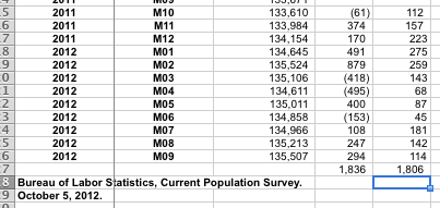
But you knew that, right, Jack? The Adjusted Household Survey shows that 1.836MM jobs have been created over the past 12 months. The Payroll Survey? 1.806MM. The difference between the two over the course of a year? A paltry 30,000 (see Page 1 of the PDF, numbers below). While there may occasionally be wide month-to-month swings (and the Household Survey is known to be the more volatile of the two), the two series generally track fairly closely over time, which is how data should generally be observed. And where were the conspiracy theorists earlier this year when the Adjusted Household Survey was flagging 400k+ job losses? Nowhere, that’s where.
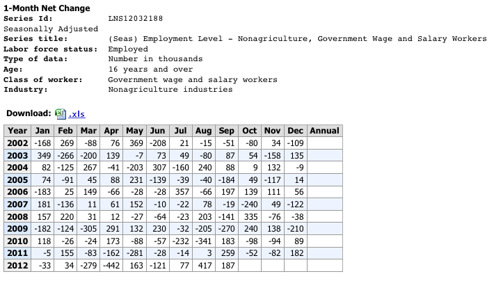
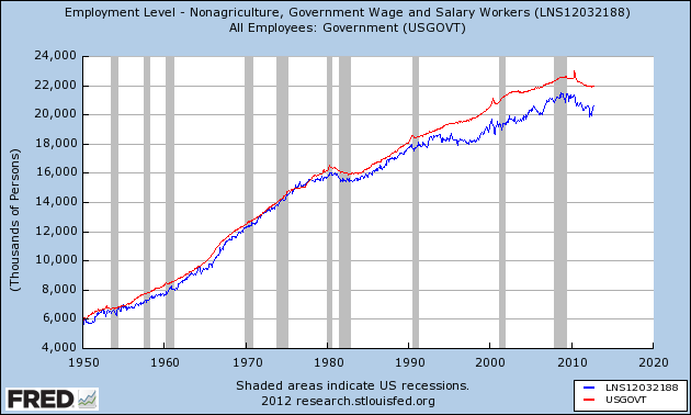
Source: BLS, Adjusted Household Survey Level (Column 3), MoM Adjusted Household Survey Change (Column 4), MoM Nonfarm Payroll Survey Change (Column 5) The notion that career BLS economists, statisticians, and staffers were collectively in the tank to produce a result designed to influence the election is absurd on its face. It’s a waste of everyone’s time to discuss and debate this. I’ve seen no one make a claim that this has been a robust recovery; it has not been, and it continues to be tepid. That said, we should be channeling our efforts on how to make it better and not making idiotic and irresponsible claims that there’s widespread data book-cooking going on. Lastly, I’ll confess, too, that I’m having a bit of difficulty confirming Mr. Welch’s oft-repeated claim that we added 600,000 government sector jobs in the past two months. Can anyone help me out here, or was that also pulled from somewhere within his bowels? I’m always open to the possibility that I’ve overlooked something, and if that’s the case, I’d love to see what it was – I can find no evidence that the government added 600k jobs in the past two months. Adding: Thanks to Jeff in Indy for the link to Mish, who points to Table A-8 (Household Data) of the release for data on the 600k bump in government employees: Now, what’s above is Seasonally Adjusted, so seasonality is out of the picture here. That said, there are clearly outliers in this series fairly often (Jan 2003 jumps right out at me, as does April 2012′s -442. And there’s no readily apparent pattern that I can discern). Again, I would stress that data of this type needs to be observed over time – it’s typically not instructive to draw inferences from one or two months’ prints. Here are the Establishment and Household surveys on Government Employees over time. As a fellow (fairly prominent) econ blogger just emailed me: “Nobody would use the household survey to track the number of government employees.” Indeed, and I don’t know anyone who has (which is why I was at a loss as to what Welch was talking about). That said, I’ll be inquiring as to the gap that opened – and persisted – since the early 90s. |
| Posted: 07 Oct 2012 09:00 AM PDT Fascinating chart from the WSJ’s Real Time Economics, depicting the monthly change in payroll. You can scroll back 30 years to 1992:
click for larger chart |
| GMO’s James Montier on European Challenges Posted: 07 Oct 2012 07:15 AM PDT From EIS, here are two excerpts from James Montier James Montier — Excerpt on European Challenges ~~~ EIS 2012: James Montier — Excerpt on Dividend Swaps |
| Posted: 07 Oct 2012 07:00 AM PDT My Sunday morning reads:
What are you reading?
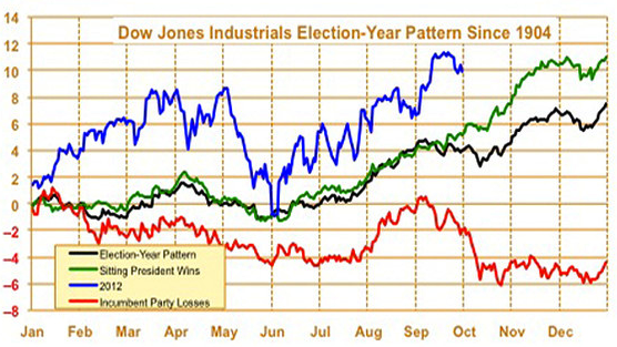
Election year bodes well for market to hit new highs |
| comediansincarsgettingcoffee: Quinn & Joyner Posted: 07 Oct 2012 06:00 AM PDT |
| What’s Your Biggest Fund Investing Error? Posted: 07 Oct 2012 03:45 AM PDT |
| You are subscribed to email updates from The Big Picture To stop receiving these emails, you may unsubscribe now. | Email delivery powered by Google |
| Google Inc., 20 West Kinzie, Chicago IL USA 60610 | |






0 comments:
Post a Comment